After a call for design submissions, we received a design from @Lionel and also a version of this design tweaked by @Armadillo. There were no more costed submissions received before the deadline.
Check out the options and please vote for your favourite in the poll below.
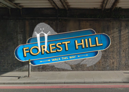
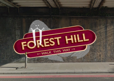
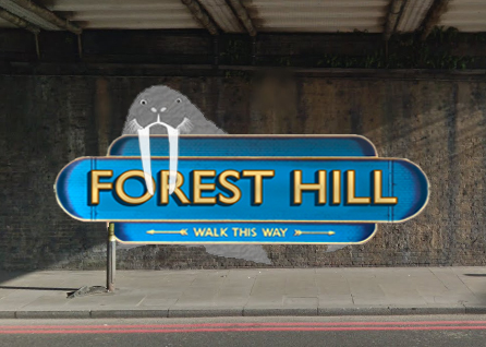
Note: this option adds a further £250 to the cost (extra colours for Walrus and extra marking out time as the horizontal design uses the brickwork for quicker marking out).
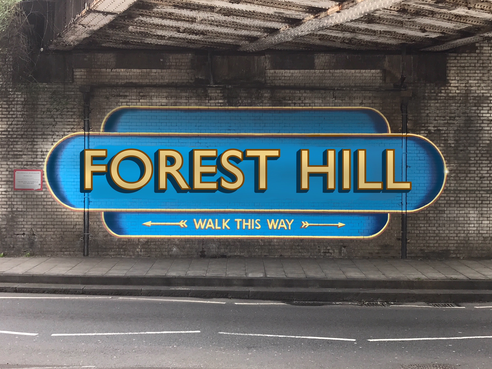
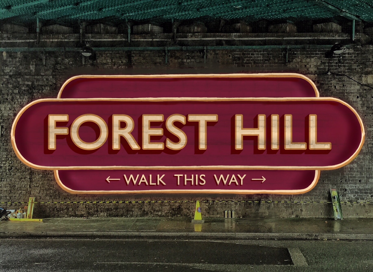
Personally I love option 2. It takes what has become a standard for SE London and gives it a unique Forest Hill twist. I like this one over option 3 as the image of the Walrus carrying the sign away is much more fun.
Cool. Any thoughts on the post itself (wording, deadline, options)? I want to make sure it’s reasonable before putting it to the public. Think I might enlarge the images in the poll:
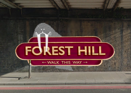
I voted for the conventional mural, mainly because the Walrus is too cartoon like, might be better if it was more reslistic? Realise this may increase cost but would make it more of a feature rather than looking like someone has added it as graffiti.
FYI, all - this is a draft, and while you’re welcome to place votes, when the final version is added to the forum, you’ll need to re-register your vote there
Might be worth noting that I’m not an artist nor very good with photoshop - so my adaption is only a very rough interpretation - i’m sure if it was chosen then @Lionel would do much better job on shading/integrating the Wulrus than I have
I’ve never liked the ‘Walk this way’ text which also exists on several other S London efforts. Not sure what value it adds.
But love the walrus - it’s fun, and says we are not taking this signage thing too seriously. It will age well, for as long as the Horniman keeps its walrus, and I can’t see that changing. representing the walrus properly is interesting, because of course the actual walrus is quite cartoon like, in that it was stuffed way too full - so that gives the artist some leeway - it does not have to look like a real walrus but needs to look a bit like the Horniman one is what I am saying.
I think Option 3 is perfect. We get the classic sign, which harmonises us with our SE London neighbours, but with the Walrus customisation that gives it our own uniquely Forest Hill touch. Not a fan of slanting the sign in Option 2 - I think it will look strange and I imagine will make the artists life more difficult (and therefore possibly more expensive?).
The only thing with having two walrus options is that it might split the vote for people who prefer something different. By which I mean in a scenario where 100 people vote for option 1, and 99 vote for each of 2 and 3, indicating overwhelming support for a walrus themed sign, should 1 still win?
If others agree on this point, I’d be inclined to ask @Lionel to choose one of the walrus options (I feel his opinion is important, as this project reflects on him as a artist and he’ll be doing the hard work).
So:
@Lionel chooses a single walrus design (either straight or slanted)
Forum members choose between Option 1 and Lionel’s choice of walrus design
Forum members choose the colour (blue / burgundy).
What do others think?
Leave three design options in place
@Lionel chooses straight or slanted walrus option for design poll
@FH_Mural group chooses straight or slanted walrus option for design poll
Offer straight/slanted as variants in round 2 of voting (when colour is decided)