Are the colour options set in stone? Quite like the idea of an Overground orange option.
Love the walrus idea. Helps differentiate us from the rest of the SE London places that have the same murals.
Are the colour options set in stone? Quite like the idea of an Overground orange option.
Love the walrus idea. Helps differentiate us from the rest of the SE London places that have the same murals.
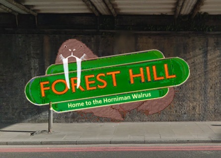
Green background and orange text, representing the Overground in the Forest.
Here’s what I mean but badly photoshopped:
A couple of points from posts above.
I would paint the Walrus as realistic as I can bearing in mind it’s onto brickwork. With some shadow onto the sign.
‘The walk this way’ with two arrows originally came from the Herne Hill Sign as the shops were split either side of the bridge and owners on one particular side felt like they were missing out on footfall/trade. Further signs had parts of the area both sides of the sign so it continued to be asked for.
Finally I like the Walrus design it gives you guys an edge on the other SE Signs but I think then putting the whole sign on the angle is a bit unnecessary. But if it’s what the will of the people vote for I’ll paint it.
Sounds like a plan straight with better walrus, no arrows not sure about orange text could be improved with white outline/shadow (not sure correct term)
I like your thinking @Lionel maybe the arrows could be on the right hand side with a right arrow pointing to London Rd (businesses & @HornimanMuseum) an arrow pointing up towards D Rd (businesses, library, pools) left to Perry vale (@AllInnOne @finches etc on Perryvale) and down for Stanstead Road (businesses like @mindbodytherapy etc on Stanstead Road)
Sort of like a North, South, East, West kind of thing. That to me is “Never Eat Shredded Wheat”,which is how I always remembered it as a kid - maybe we could create our own words for N, E, S, W that compliment FH, or maybe my brain is pushing it’s luck & going into overdrive. Though sure I’ll think of something.
Thinking cap is ON!
@Lionel can you pop by my shop soon so we can finalise everything with Ed from Network Rail please.
Thanks, P 
Marked this as like.
Should be triple liked.
It is important to recognise Perry Vale and all of its many businesses - established and nascent - amongst others @finches and @AllInnOne - who are a significant and integral part of Forest Hill
I knew all the design ideas would start flooding in after the design submission deadline! 
Regarding the arrows, perhaps let’s just keep the left and right on Lionel’s mock-up? (right pointing people toward the entrance to Perry Vale).
Reminds me of a Camel is a Horse designed by committee 
@Wynell I feel should make his mind up.
Introducing camels and horses at this stage - just when people are getting the “Walrus” thing sorted… - well it all adds to the confusion
Until now I have not seen reference to a committee - do we have to apply or are we all co-opted ? .
It’s been brought up that @armadillo has been a bit rail-roaded here, and I agreed it’s unfair on him for me to rule out the slanted-sign design, which was his own original and preferred design.
So tomorrow’s poll will be traditional vs. walrus-slanted. The second round poll will choose colour variants and design variants (straight/slanted, if the walrus option is chosen).
Very excited to see what happens when the public votes - think this could be a lively couple of polls!
Poll to begin at 8am Friday 14th Dec