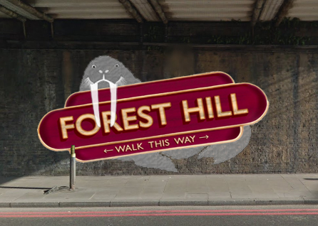
Note: this option adds a further £250 to the cost (extra colours for Walrus and extra marking out time as the horizontal design uses the brickwork for quicker marking out).
Yes - ‘a touch of Walrus’ was listed with permission from @Lionel with agreement to paint it if it ended up being the chosen design (agreement from an artist to actually paint the work was a requirement of all submissions).
Although, I’m sure @Lionel will do a much better job of adapting his design than my shoddy paintshop skills allow
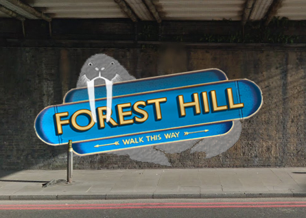
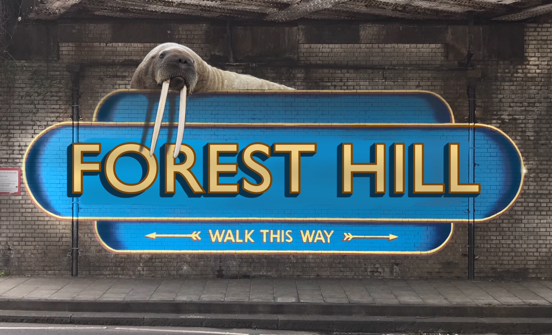
Also just in case it’s not 100% clear - if you are voting for the walrus option there will then be a second vote to decide whether the sign will be slanted (shown in the main image) or horizontal (in the design variant image). And the colour will also be subject to a further vote whichever option wins.
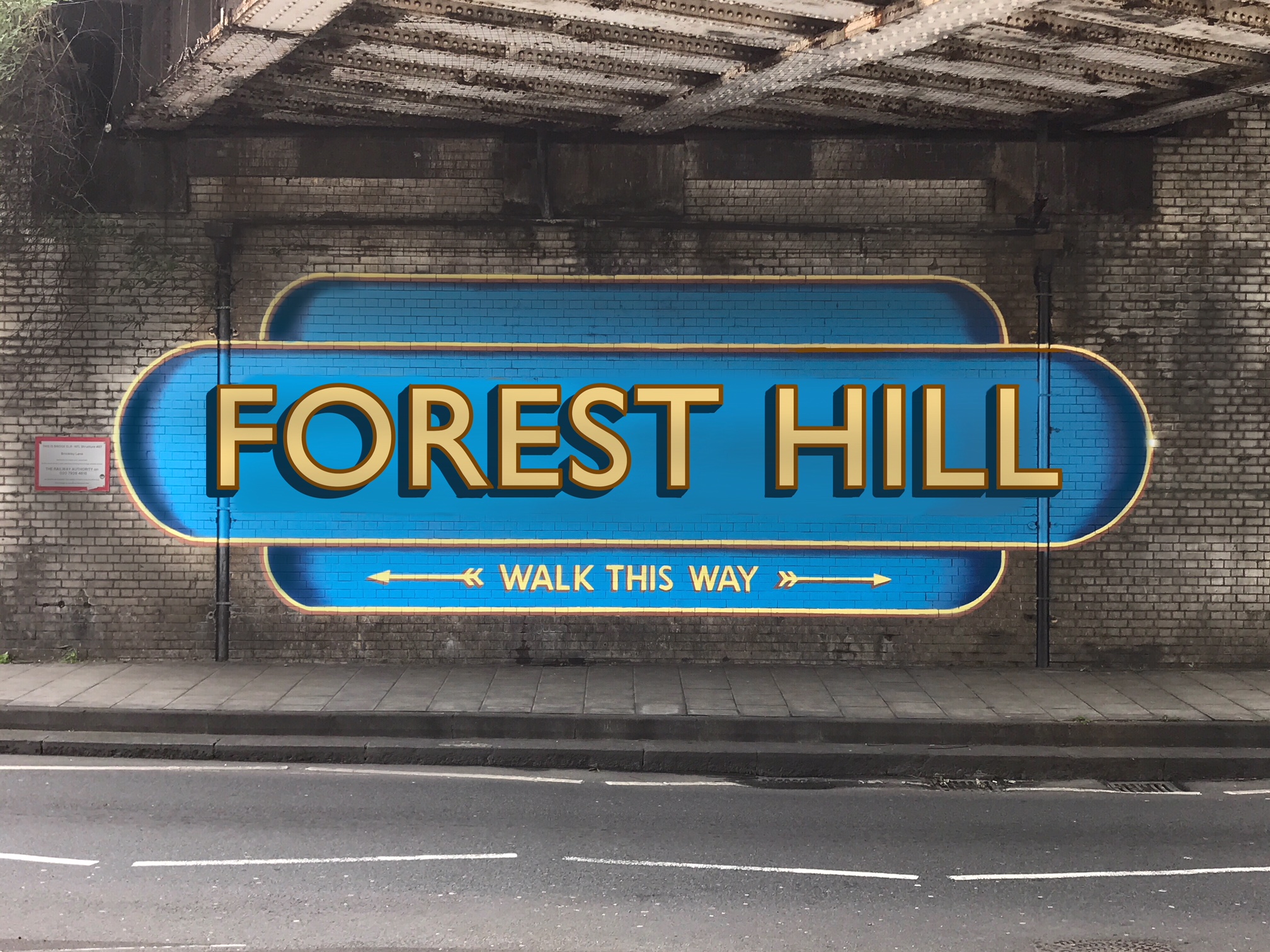
In terms of size, Option 1 looks way too big. I would recommend keeping it to the size shown in Option 2, so more space above and below. Even at that size, given it’s bright blue and yellow, it definitely won’t be missed.
Re Option 2, most definitely not the sign at an angle! The sign being the strongest visual element, it will just look way off square, especially from a distance where the walrus is less noticeable. Also, and I know it’s only been Photoshopped, but if the (straight) walrus is chosen it will need to be darker and integrate more with the sign, so shadows added behind the tusks and on the body where the sign sits.
Were there only those two designs submitted?
It’s kinda cute and 19th century looking but not that exciting given it’s pretty much the same as the other designs in neighbouring areas…
I’d rather have a sign that was individual to FH, and not a continuation of those in several other places around the district, excellent as they are. But we don’t have an option for that, for reasons explained. Accordingly, my vote has to include the walrus.
I’ve registered a vote by accident. I was only trying to enlarge the image.
I kind of like the Walrus version but I have reservations about the fact that the grey body doesn’t stand out enough from the brickwork; and I think the traffic pollution will lose even more definition. So would some sort of outline around the Walrus work perhaps?
“I have reservations about the fact that the grey body doesn’t stand out enough from the brickwork; and I think the traffic pollution will lose even more definition. So would some sort of outline around the Walrus work perhaps?”
i agree, and am thinking lighting here, crowdfunder stretch target maybe?
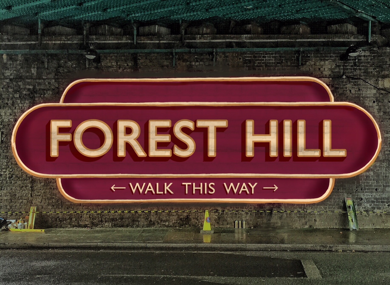
I like the sign with walrus but I feel that with walrus, the sign itself ‘announcing’ Forest Hill will end up looking quite a lot smaller than other locations with similar signage and with the text ‘squashed’ (as @anon22025233 observes that it is above). It could result in it looking ‘lost’ on that wall.