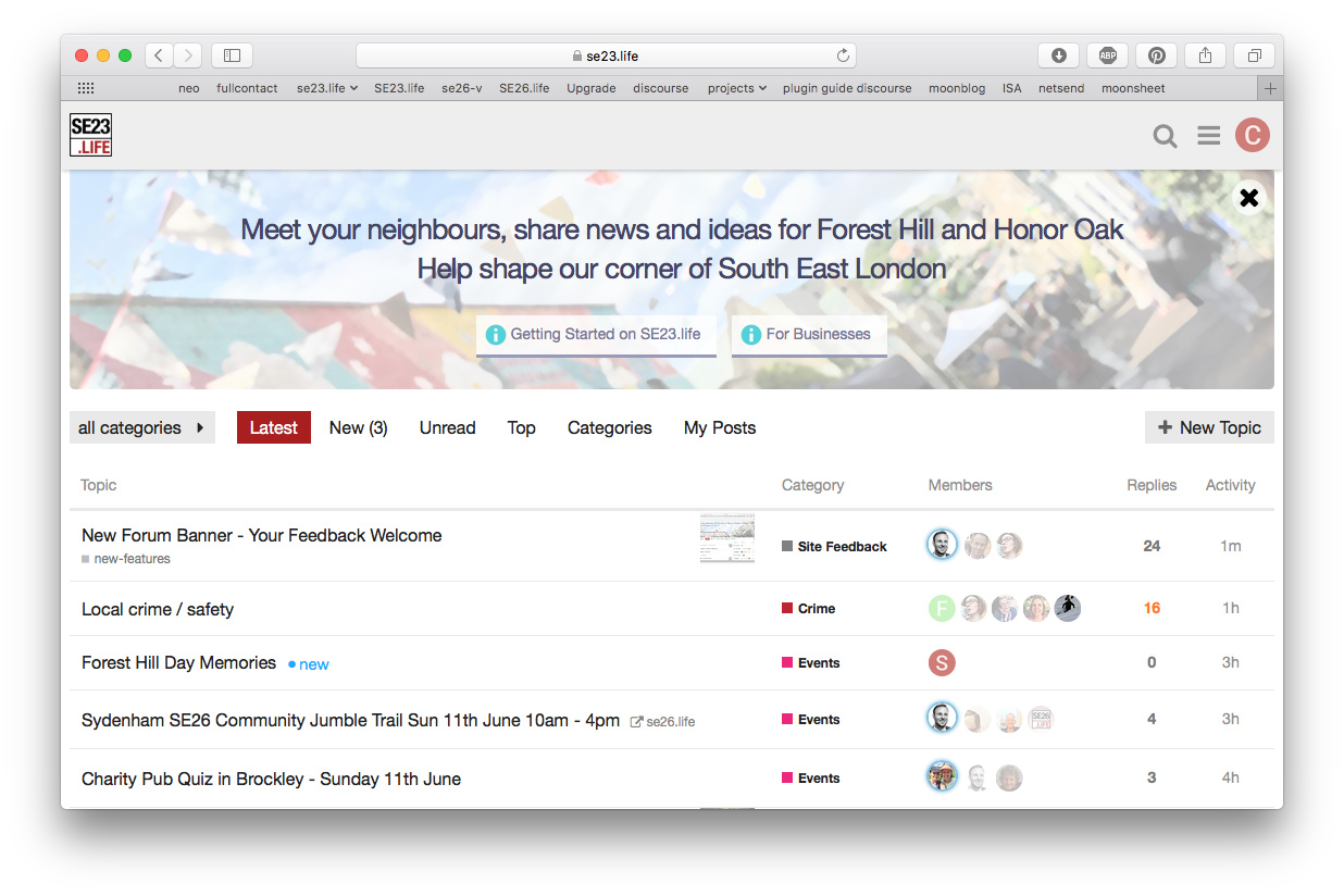
Okay, let’s go with “paint daubs” for a bit and see what people make of it 
Have also tweaked the kerning on the header and put a semi-transparent white circle behind the x to make it stand out more
Okay, let’s go with “paint daubs” for a bit and see what people make of it
Have also tweaked the kerning on the header and put a semi-transparent white circle behind the x to make it stand out more
I’ve edited the text and made the second line the same size as the first. I think it looks a bit better. The first version was a bit weak, font-wise.
Can we centre those two lines of text (couldn’t see how to do it)?
I’ve done this, and also tweaked the buttons to be centred. What do you reckon? The floating close button interferes a little bit with the centred text
I think it looks better. I’d also like the text to be a bit chunkier, if that’s possible. Does it have a white shadow?
Cool - have fixed the centring (clear: both on the header), and switched the site-wide font to Helvetica Neue, which is a little chunkier when used as a heading.
There is a subtle white shadow under the header to make it pop out from the BG. No likey?
No likey. It makes me squint to see what’s ‘wrong’ with it. Simpler is always better, imo. I do like the new font, though.
Okay… compromise - I have moved the shadow closer to the text so it’s more subtle.
Are you very wedded to the shadow? In self-publishing, shadow screams ‘amateur’ so it raises a red-flag to me.
I don’t think you need to add anything to make it stand out - in fact you are blurring the text because the shadow is light and so is the background.
After mine and Rachael’s redesign, the banner is now shorter.
I’ve just fired up a virtual machine to check IE and the scrollbar is gone 
Need to move the image so that chimney doesn’t lie directly under ‘shape’
Okay - I hear you - shadow is gone.
Ah… this is where things get a bit tricky. The image is set to “cover” mode to ensure it adapts to different browser widths… so it will move around a bit when the browser is resized (as will the text flow during resizing).
Okay. I do think the text looks much better without the shadow. Can you make the image a touch lighter? That might help it interfere less with the text. It’s quite a busy image.
Done.
Looking good!
On my phone I no longer see the second line of text. Still see it on my iPad. Is that right?
Yup, that was an intentional change - the combination of the two lines of text was quite a lot of smartphone screen real-estate and looked a bit much. Also it caused the buttons to be hidden.
It looks good. 
And now, after all that, let’s hit the x and forgedabaaadit