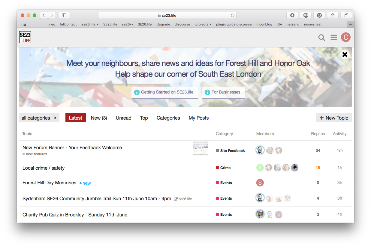
After mine and Rachael’s redesign, the banner is now shorter.
I’ve just fired up a virtual machine to check IE and the scrollbar is gone 
After mine and Rachael’s redesign, the banner is now shorter.
I’ve just fired up a virtual machine to check IE and the scrollbar is gone
Need to move the image so that chimney doesn’t lie directly under ‘shape’
Okay - I hear you - shadow is gone.
Ah… this is where things get a bit tricky. The image is set to “cover” mode to ensure it adapts to different browser widths… so it will move around a bit when the browser is resized (as will the text flow during resizing).
Okay. I do think the text looks much better without the shadow. Can you make the image a touch lighter? That might help it interfere less with the text. It’s quite a busy image.
Done.
Looking good!
On my phone I no longer see the second line of text. Still see it on my iPad. Is that right?
Yup, that was an intentional change - the combination of the two lines of text was quite a lot of smartphone screen real-estate and looked a bit much. Also it caused the buttons to be hidden.
It looks good. 
And now, after all that, let’s hit the x and forgedabaaadit